
David Bisgrove Brand Identity
David Bisgrove’s brand embodies wisdom, stability, and renewal. It reflects a grounded approach to leadership and personal growth—one that balances spiritual depth with strategic clarity. The visual identity draws on calm, confident tones, refined typography, and minimalist design elements that communicate trust, integrity, and guidance.


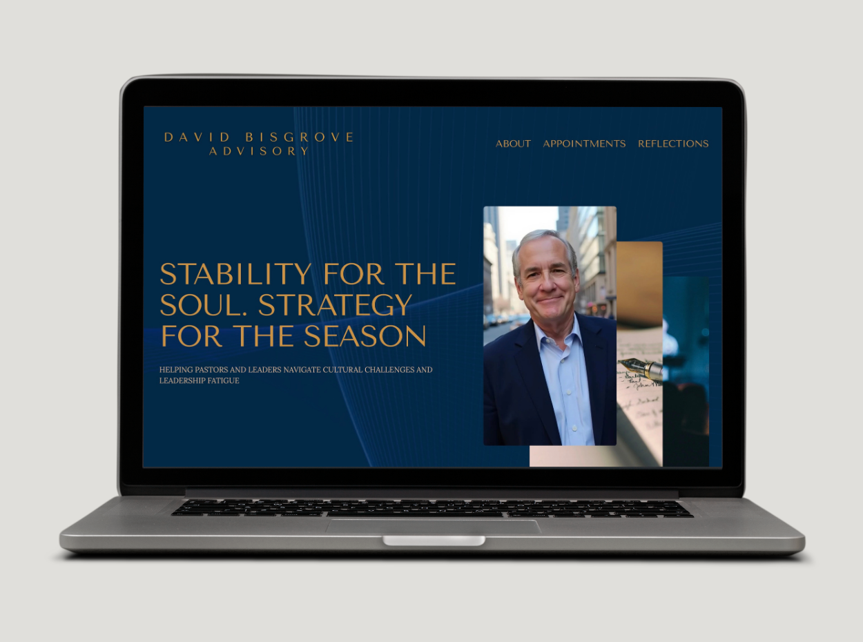
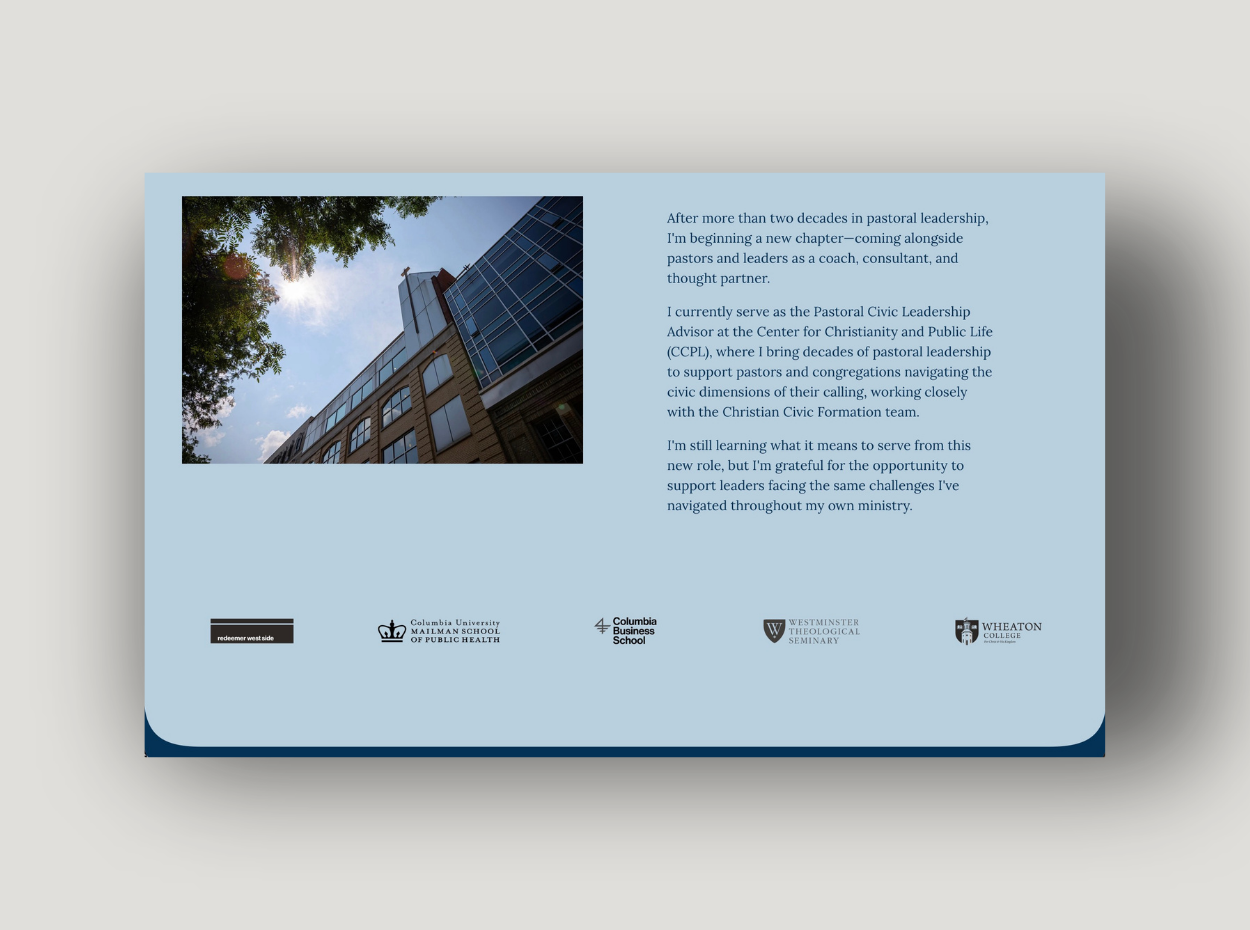
Every element—from the logo to the business card to the website—conveys steadiness and warmth, mirroring David’s mission to help pastors and leaders navigate cultural complexities and overcome leadership fatigue. The brand evokes stability for the soul and strategy for the season—a modern yet timeless expression of grounded support and a clear path forward rooted in wisdom.
This cohesive identityensures David’s presence as a trusted voice and steady hand across every platform, reinforcing authenticity, clarity, and hope in leadership.


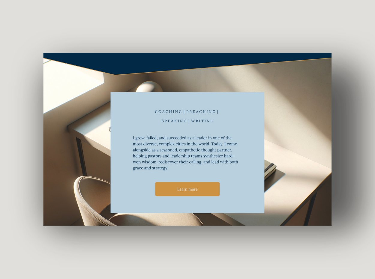
The brand’s tone is calm yet confident—anchored in empathy, clarity, and discernment. Its aesthetic avoids noise and excess, instead favoring space, balance, and intentionality to mirror David’s coaching philosophy: creating room for reflection, growth, and renewed purpose. Subtle textures and natural hues reinforce a sense of grounded wisdom, while clean lines and modern accents suggest forward momentum. Together, these elements form a visual and emotional language that invites trust and inspires leaders to realign with their calling—rooted, resilient, and ready for the next season.


Explore More

